Welcome to my webinar on bringing a simple quick sketch into a full color Instagram ready attention getter. We will be using the app Pixlr and personally I am using a Galaxy S4 active for most of this demonstration. To give the clear understanding on what we will achieve upon completion of this webinar here is the before and after…

So to start off with I must say that this process works for me knocking out what feels like a finished piece in a very short period of time but by no means is really finished for print purposes or any firm of publication. This is a strictly for media based events so the resolution doesn’t need to be great to come across well. Now when it comes to the initial drawing this will just be my bias preferences and by no means should be taken as a do it this way because you should do whatever makes you comfortable. Those points aside let’s begin….
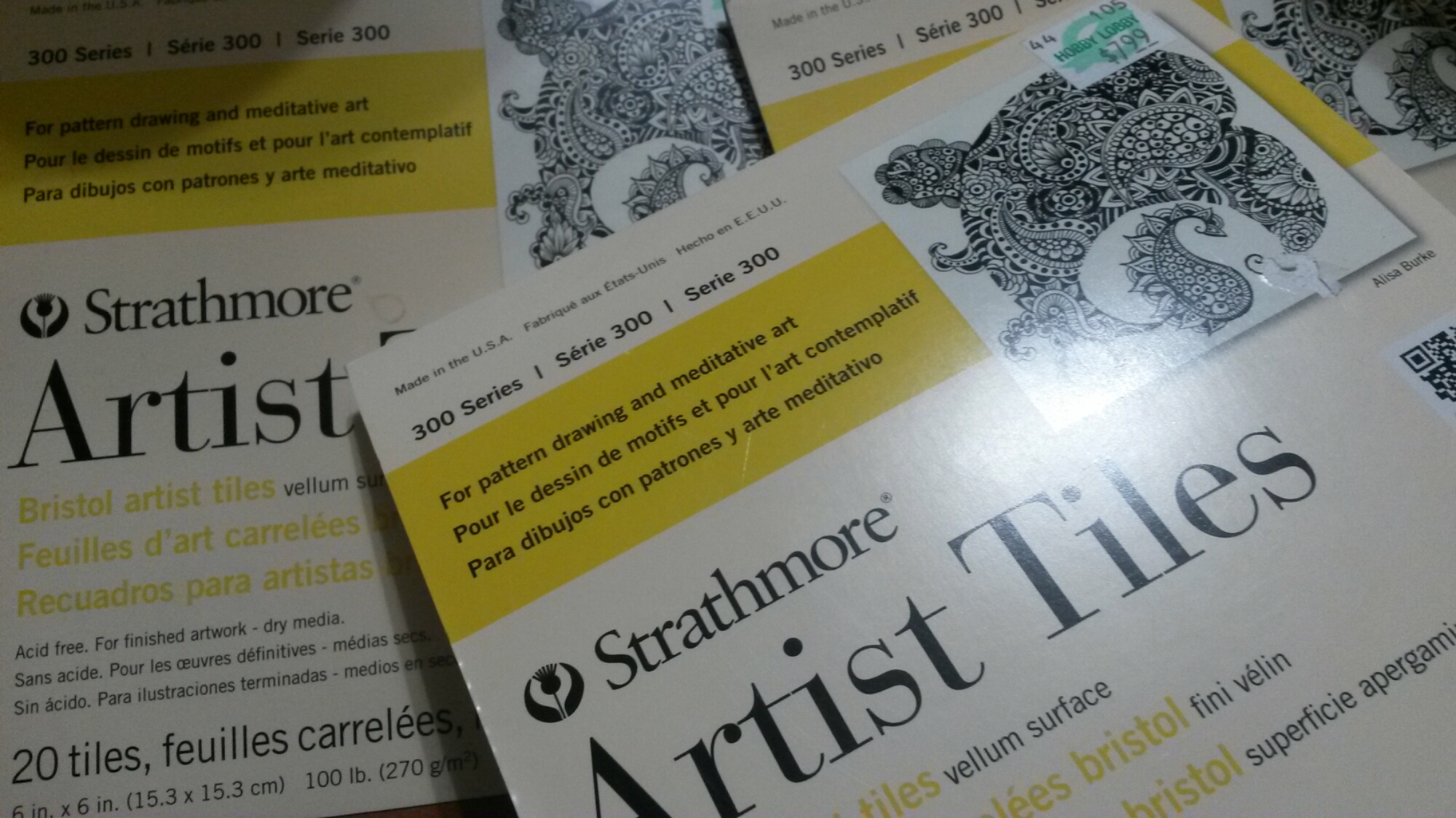
The drawing surfaces I used for every last one of the Advent of the Archetypes series was the Strathmore Series 300 Artist Tiles. They are bristol with a vellum surface that hold ink and pencil well but can take a beating under erasing. For the quick sketch I love this because I tend to smudge a lot for quick shading and then can easily erase where it goes over the line. Next up is the pencil.
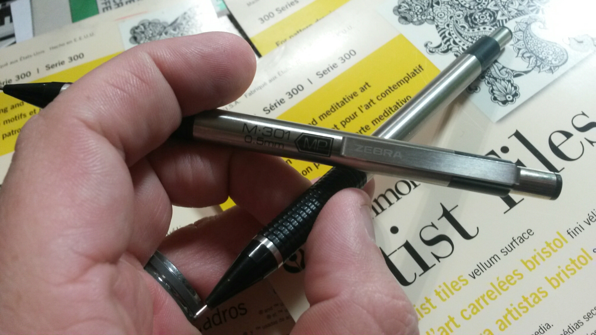
For quick sketches I always use the M301 .5mm Zebra. It’s versitisle cheap and moves easily in the hand for that quick shift of how you hole the pencil. The next thing I do is two things: I pull up references of what I want to draw (typically historical time line examples of character evolution) usually a simple Google search or pulling a book off my shelf and the second is I grab theses helpers.

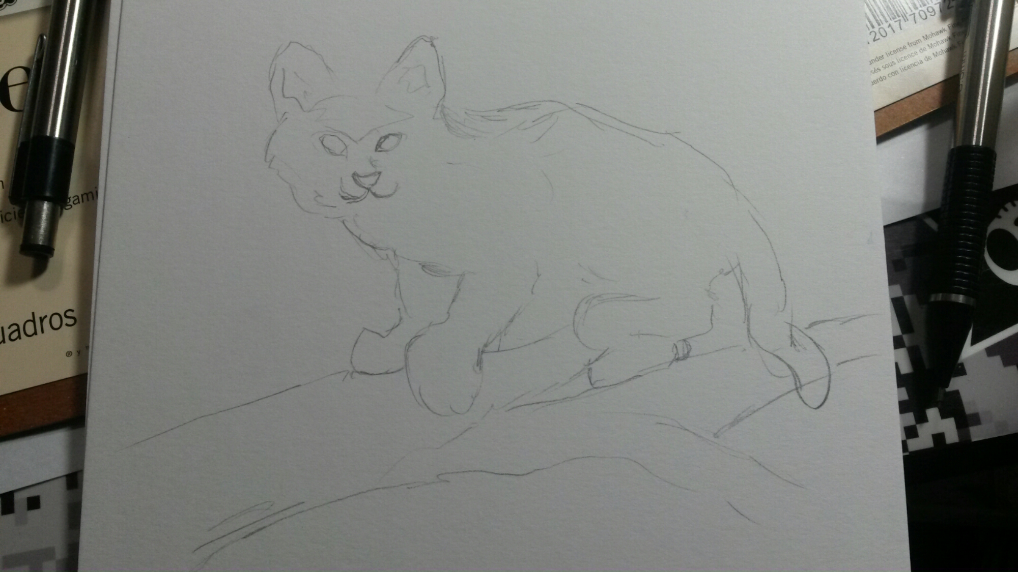
These along with some possible action figures help me really capture the more natural poses. I can point out the images I didn’t use a model with and that is because they tend to feel more stiff and may have errors as well. This is often how someone ends up with a limb a lot longer than the other. So once I have the drawing in mind I do a rough outline sketch to get the proportions in place. So let’s start with the Cheshire Cat here.
Next we do the detail and shading and we get the drawing to this stage… (more or less a relatively finished drawing)
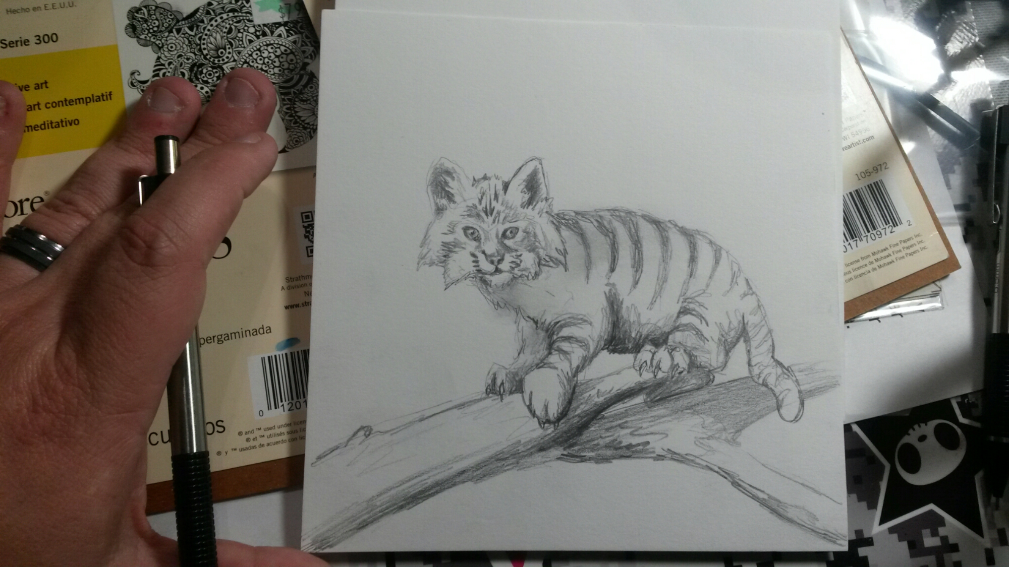
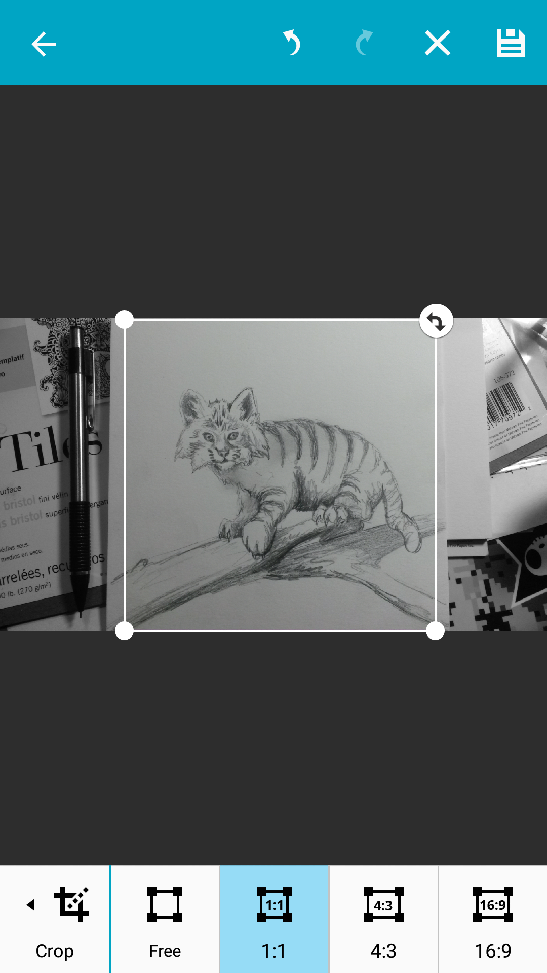
OK it is not perfect and it was only a 5-10 minute quick drawing and honestly that is what I want. I could spend hours making it just the way I want it but I am not here to make a masterpiece pencil drawing. So now on to digital. So begin by cropping. On Android phones which I use I always crop in Gallery under edit. I always set it to 1:1 because since it will be seen most heavily on Instagram I want it to be in the dimensions it requires so I don’t have to cut into anything I do later.
Now that it is cropped and saved I close everything and move to Pixlr. This is my knew favorite app for so many quick filter fixes. So let’s open the image into Pixlr and you should see it like this.

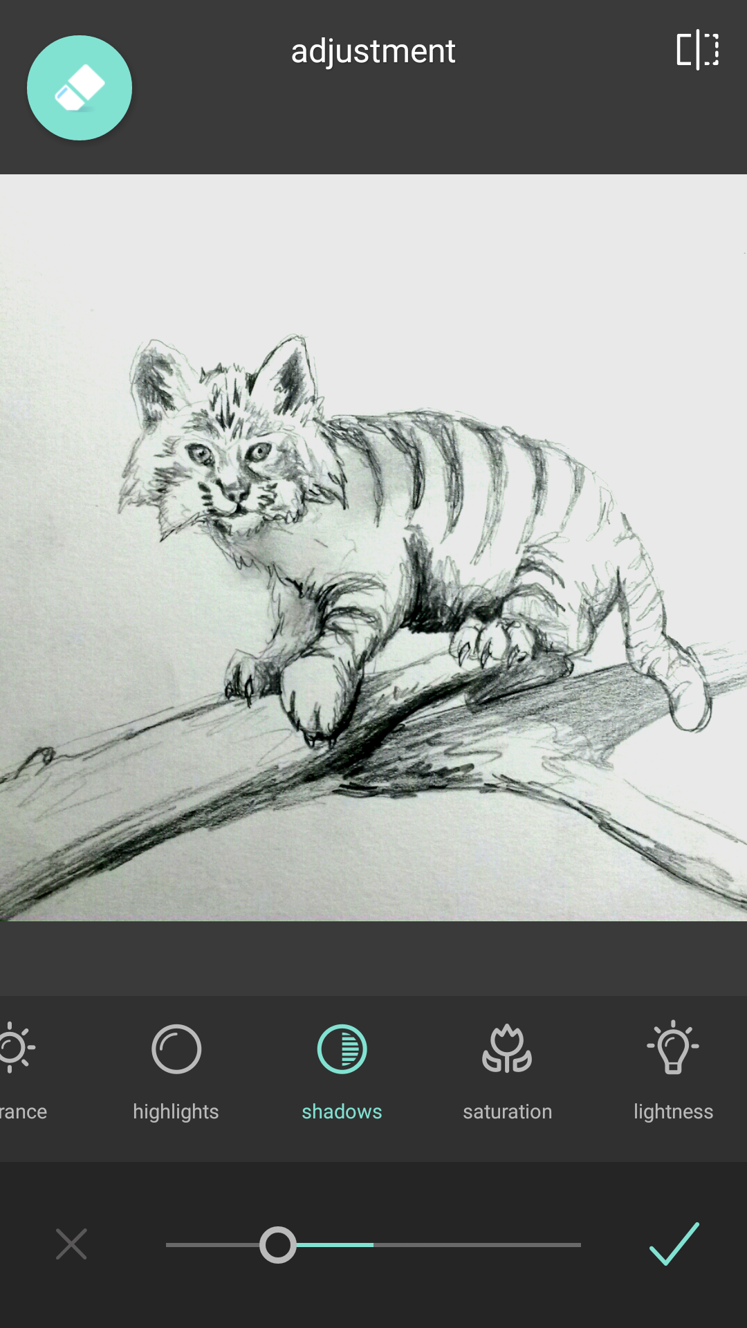
Okay now see that double circle second to left on the bottom? That is where all your standard image adjustments are that you expect in photoshop like apps. Under “adjustment” you will find the usual contrast, highlight, saturation, vibrance, saturation, exposure, etc. So first I turn the shadow dial left into the negative and the highlight to the right to positives. This widens the shading curve that was most likely minimized by your picture being taken on a phone in less than ideal lighting. I also play with contrast a little but you have to be careful here because this app likes to blow out detail quickly and you end up with over exposed images. So when you made all your adjustments hit the check mark on the right to save all the adjustments you just made.
So once you have clicked that checkbook and are back to that main screen it is time to navigate the rest of the program. On the main screen you will see other tabs next to the double circle.

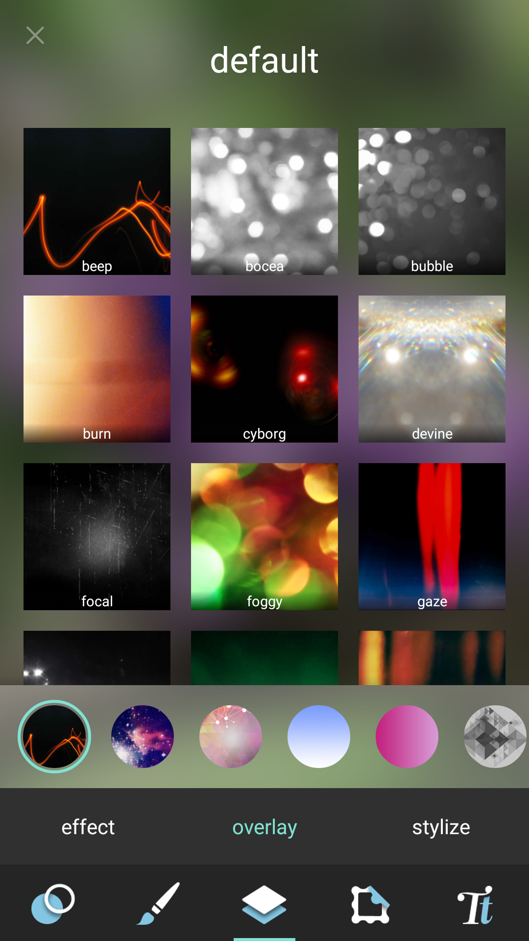
The double page icon (overlay) is what we want to click on next as seen above. It will automatically default to the default picture page and the submenu “effect”. Take a moment to scroll through this to get an idea of what section is. While the filters are programed to do the same to an image no matter what it is the effect may give you something you had not considered or give you an idea of direction.

The first place I go is Unicolor which is just a few swipes right of default. This will be where I look for giving color to the image. If you wanted a redial cat notice how Cloe looks good with mining a dark line but red body. Same goes for Ethan if you wanted a gold colored cat. I like the tone of Daniel but I don’t like the lines are too blue. You may or may not find what you would prefer here but wait there are more options.

Switching to overlay you will see this screen here. There are so many features here we could spend weeks talking about them but for now we are going to make it simple and start swiping right.

When you land on candyminimal. Wow look at all those colors! Now try clicking on one to see what it does.

I selected lollipop here for that purple Cheshire look with some color variation but it isnt quite what I want. Now the icons below the image are super important as they are flip horizontal, flip vertical, and 90° rotation. This will put the colors where you like it best.

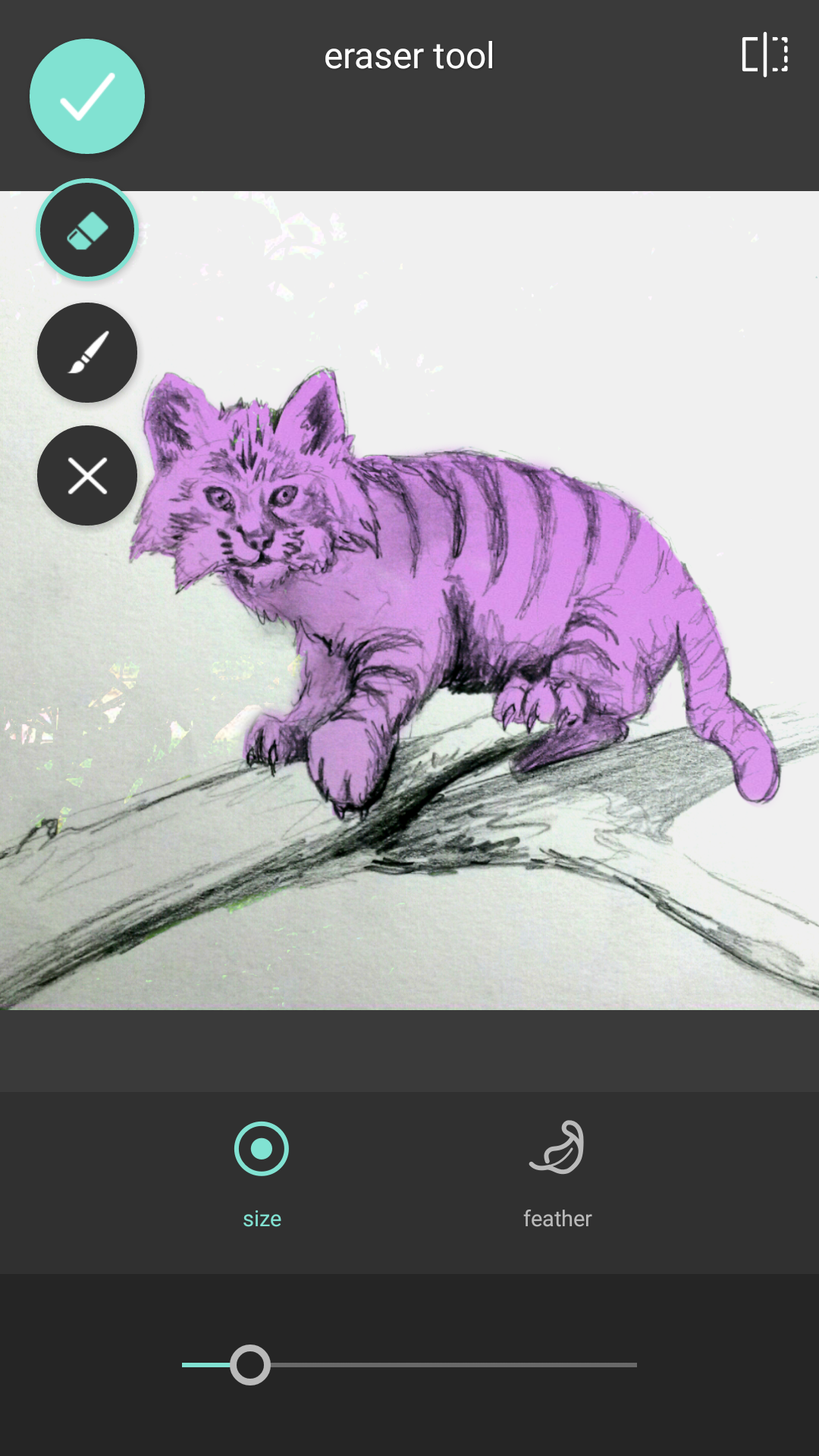
Here we see the horizontal flip giving the cat a different look. Once you like the coloring click on the eraser icon at the top left.

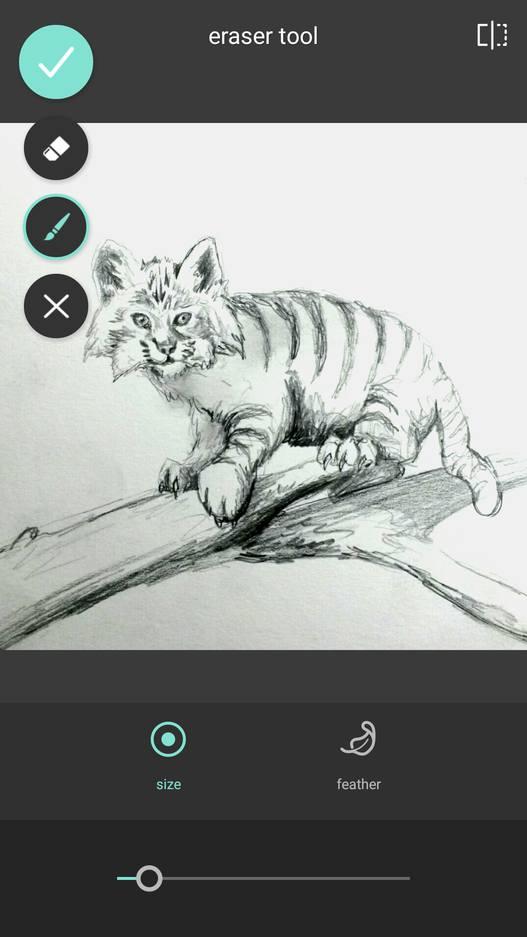
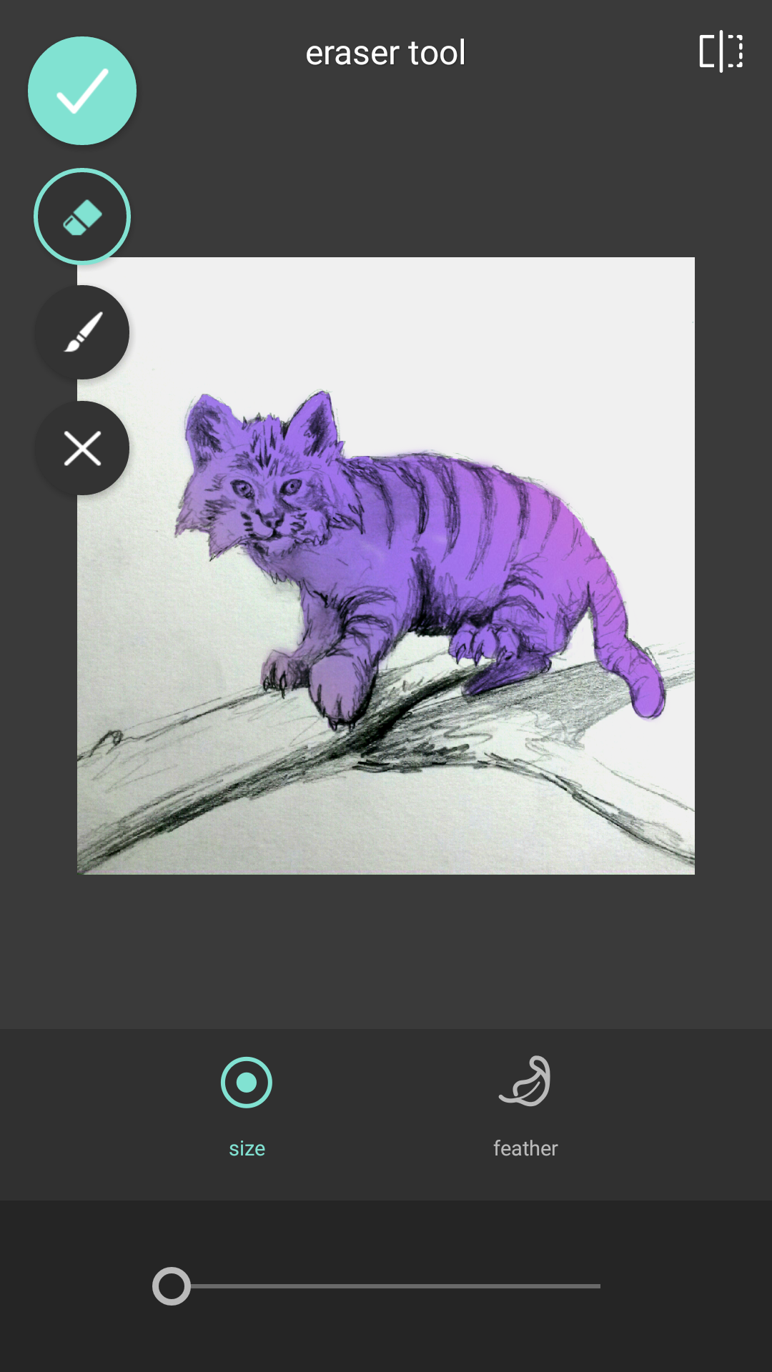
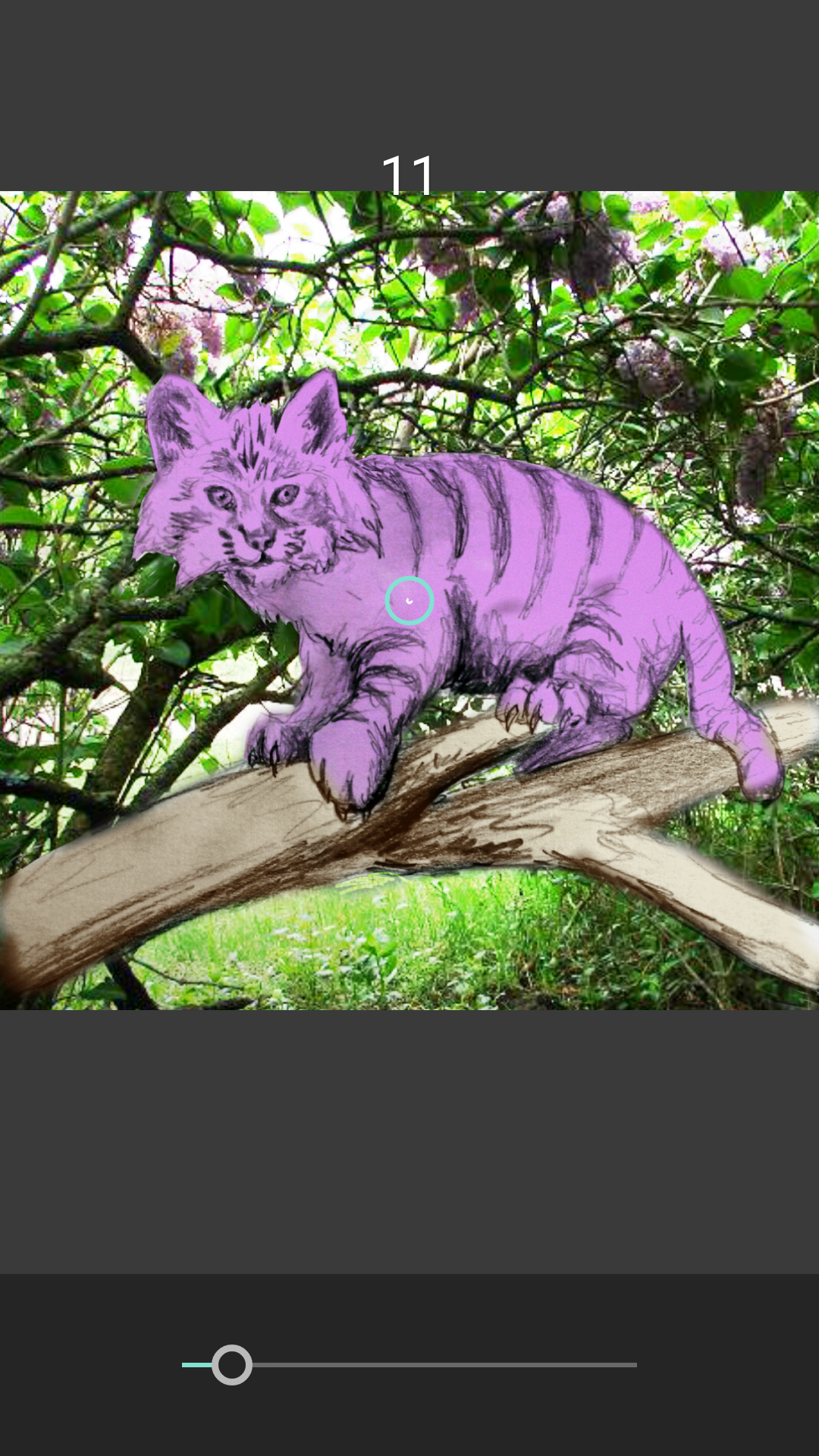
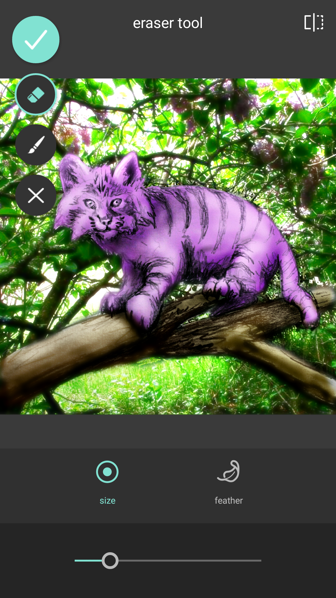
You will see this screen here. The size of the brush can be adjusted as well as the feather. So the first think I do is set to the largest brush and I erase the whole screen with a few finger strokes.

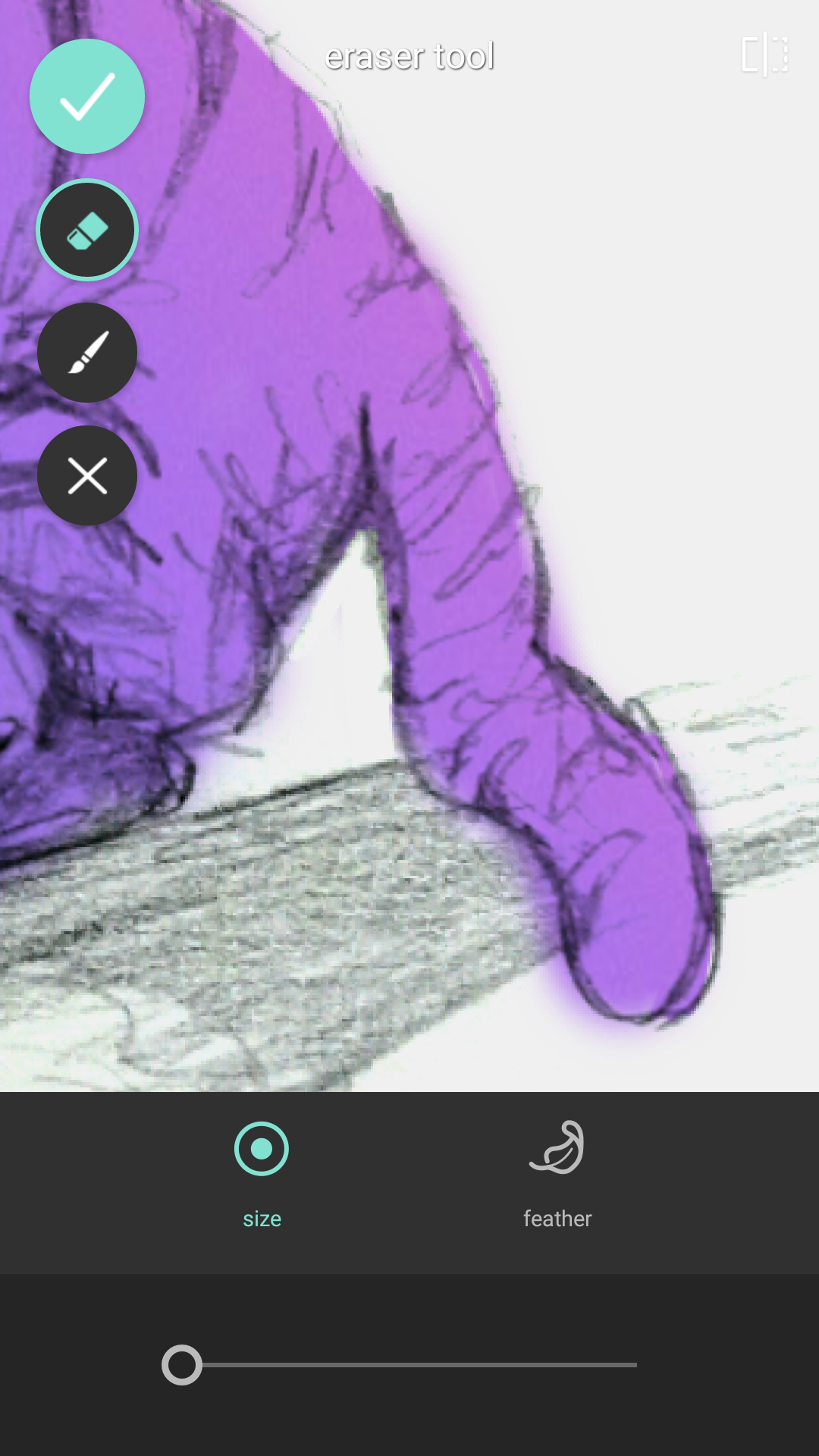
At this point it looks like you are back to the gray image from before but I assure you that you are not. Here adjust your brush smaller to where it fits easily inside the limbs of the cat.
 The size will be quite small and I keep feathering to a minimal as well because we are looking for a flat color basis for now. Now click on the paint brush. You will begin literally painting back on the filter you erased. It is like working with a scratch board. You can zoom in at this point by using the standard 2 finger punch and pull like in photos.
You will see something like this start to appear. When you are done but like me you will inevitably end up with coloring outside the lines like this. You can easily switch back to erase and adjust.

Clean up can take some time so don’t get discouraged but don’t stress too much either. So after all the detail work zoom out and see where you are.
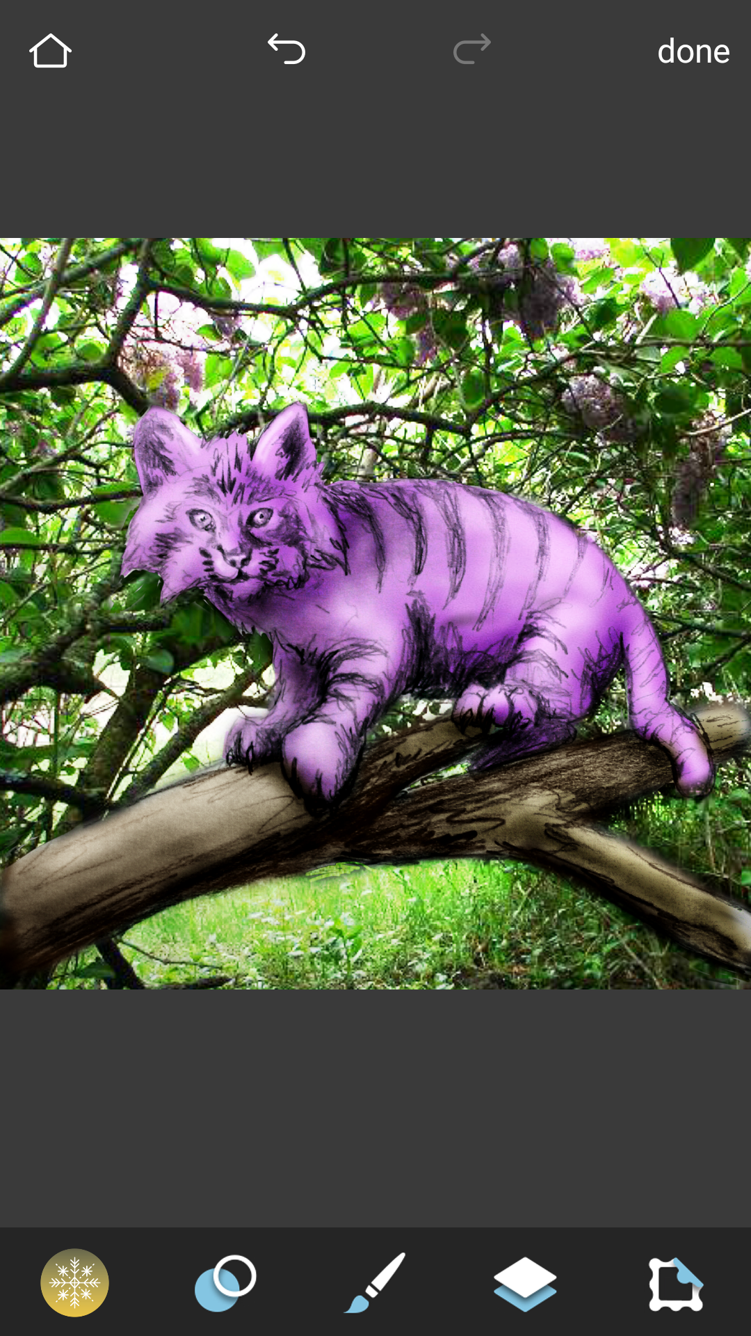
You should end up with an image like this. Click the arrow above on the top left and you will notice it will return to a menu of selecting the candy filters as a side scroll and there is the check box at the bottom right. DON’T PUSH IT YET! You will want to click this only when you are ready to finalize all that you just did but you know I am not really like this color pattern after all but I don’t want to do all that brush work again. If you click on the other filters it is like magic seeing the changes.
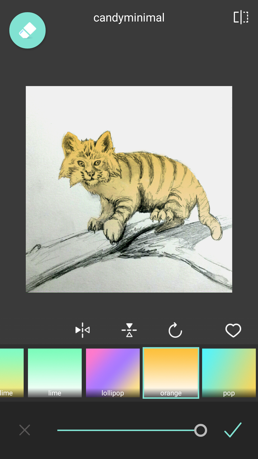
Here is the orange candy filter. It’s so cute and pretty and looking more real but is not really that Cheshire feel. So keep testing.

I find rockcandy and fall in love however here I rotated it 270° degrees to place the lighter gradation to the bottom. Once you are set on this being what you really want hit the checkmark and it finalizes all that work and flattens your image. So don’t do this until you are positive you are ready to move on.
Make sure you save after every step. You can always use undo and redo but if your phone dies or app crashes all will be lost. For the next step you will need an image you would like for the background so either create a background, take a photo or go online and pull a stock photo. When you select one make sure that is a good resolution that you would like to see in the background.
Once complete the next step you want to do is click on the double circle menu like we discussed in part 1. Remember this menu?

Okay so now you are going to select the “double exposure” button at the top right. You should see this pop up.
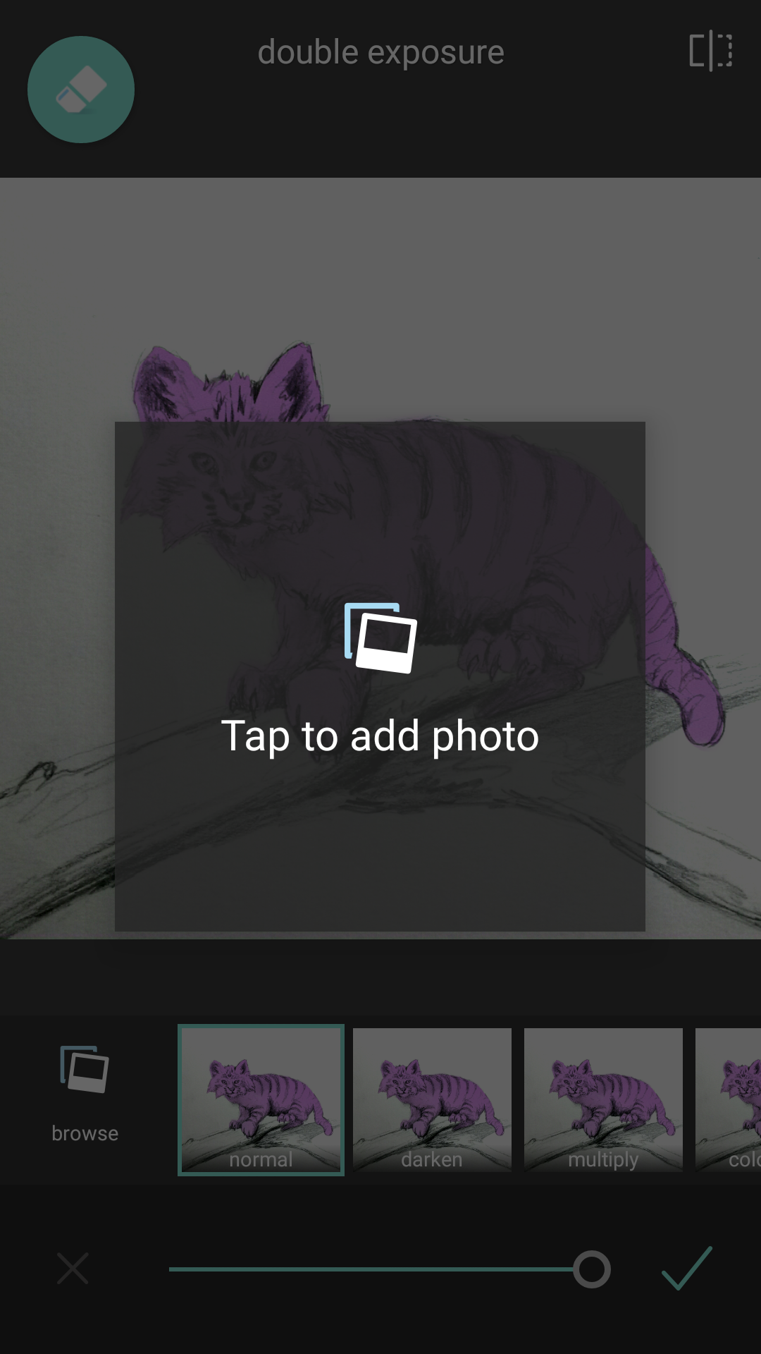
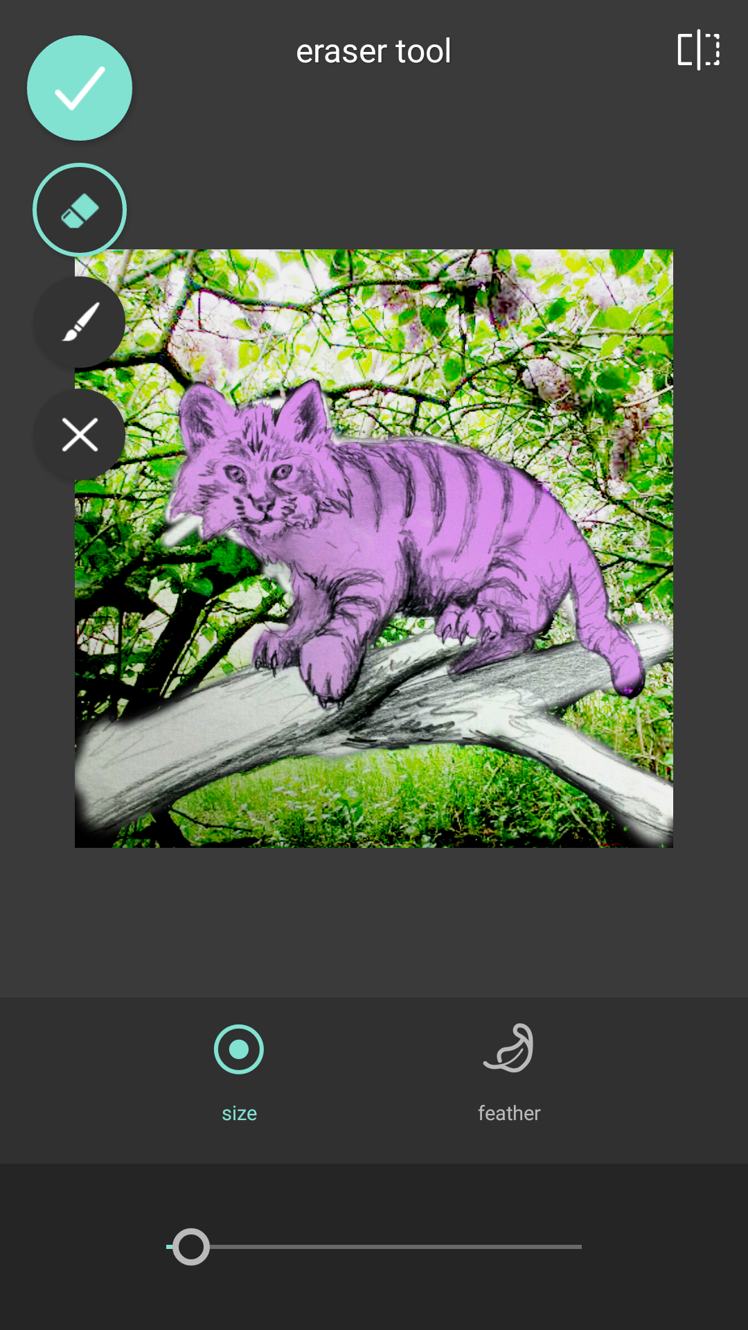
Tap in the box it asks you to tap on and it will give you your standard selection options for where you would like to pull an image from your phone. For most android users this will either be gallery or photos. Once you have selected and approved the image you are importing it will be downsized and dropped on your image like so.

DO NOT CLICK THE CHECK BOX YET!!!! There are two important steps here. First the image is sizable, movable, and able to rotated by your standard pinch, pull, and drag finger gestures. Once you have it filling the screen the way you like it on to the second thing you need to do before anything (again do not hit the check yet). See all those options… normal, darken, multiply? Start scrolling through those.
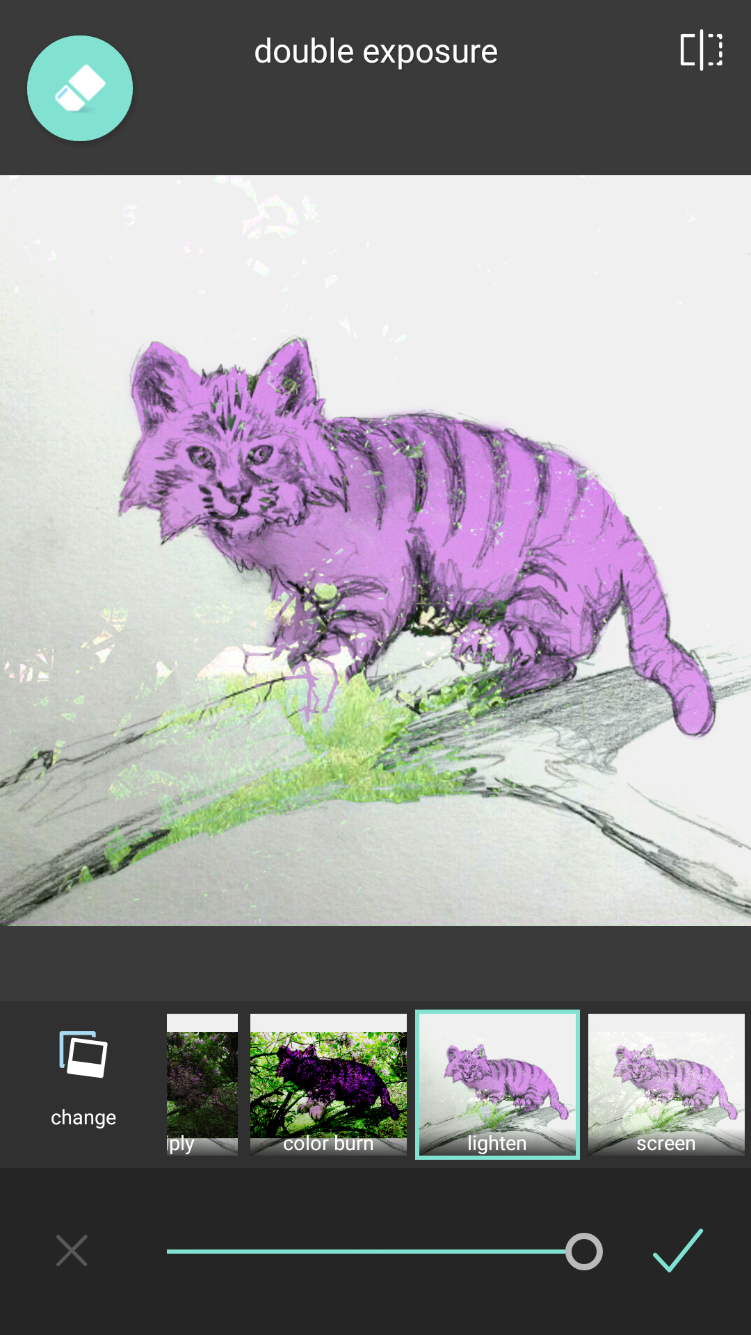
We are going to more often than not select lighten so we can see our drawing mostly with a little bit of background only. (Still don’t touch that arrow till I tell you) Next we are going to select that eraser toll again.
Making the brush small, erase just over the part of the image you do not want the background to bleed through. The image above you will see that I have done as best as I could but it’s hard to tell where I mave have missed. So now we want to swith the mode off of lighten.

By selecting color burn you will notice the dark shadows over your drawing. Those are the spots missed in erasing. So once again go through and erase out the shadow areas.
It is okay if you go outside your drawing because just like before you can go in a repaint with detail to get right up to the line. Remember: It is easier to paint the background back on than it is to find the edge of your drawing.

Here you can see areas of the image still burned while other parts are being repainted up to the line. Don’t get discouraged as this may take a while.
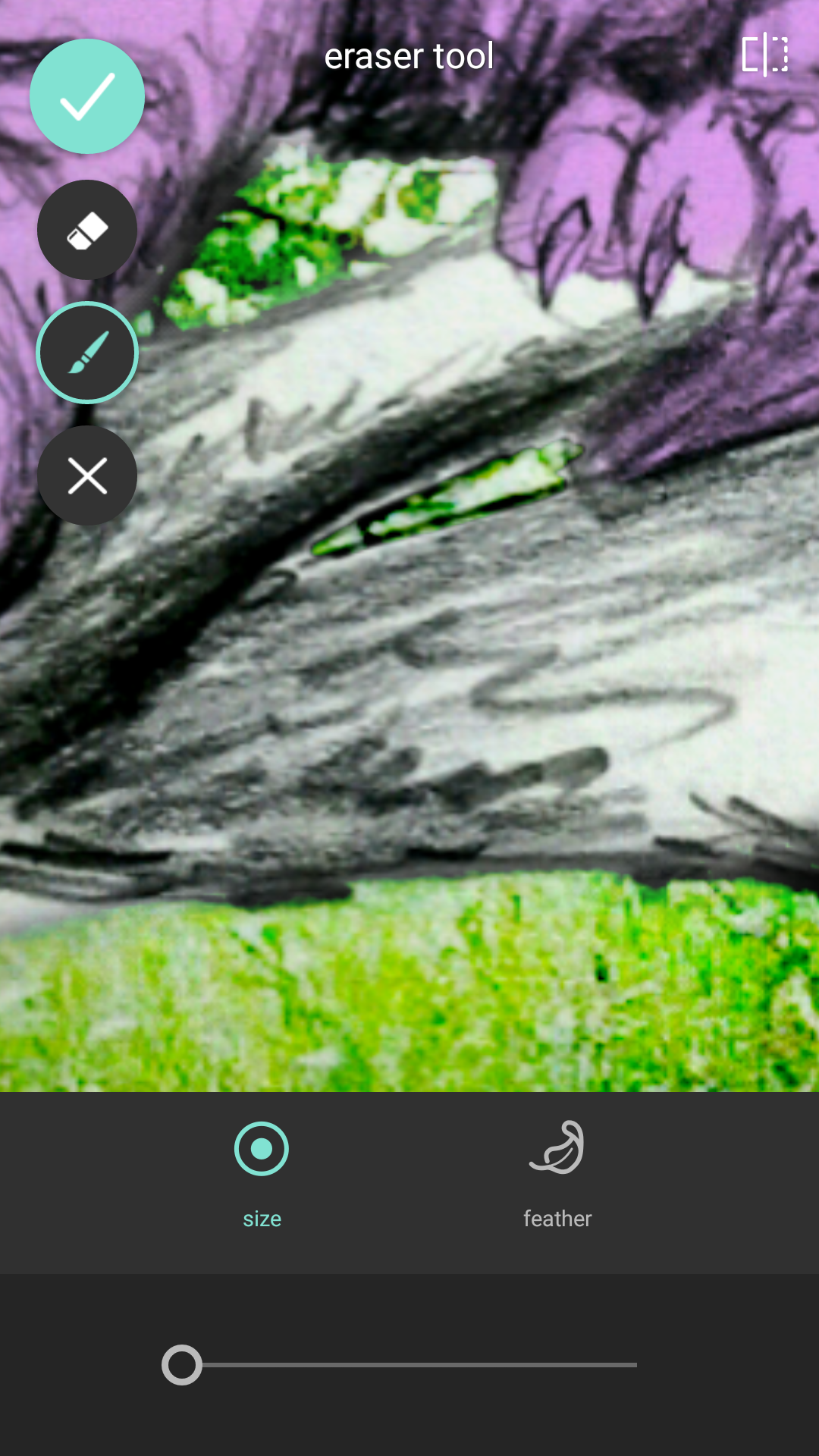
Double check of an holes or windows your image should have to reveal the background.

Finally zoom out to make sure all looks good. Hit the check box for the erase tool in the upper left. You can one last time pinch, pull or drag the background to see if a different placement will work for you.

So we know have here is a white branch that can use some color, the cat is feeling a bit flat and the background is clearly a super imposed image. So let’s start with the branch.

Let’s go back to that double layer menu and scroll to the right till we hit the Unicolor tab. I scrolled down here to Kirsten because I like that color the most for the branch here.

Just like before we will go into erase and erase it all out and paint back just on the branch itself.

After painting I decided to switch to James instead of Kirsten because it looked more natural. Reminder: not only can you change the filter before hitting the check but you can also use the sliding bar to adjust translucency. Okay so now to do some thing about that flat feel. We are going to select the paintbrush in the bottom center.
There are two things we are going to use here. First is darken and then after we had some shadow we will use highlight to really bump the depth. So select the darken first.

Just like the erase tool you will see your size indicator cursor with the inner circle being your feather width. We want the widest feathering so every stroke is supper soft with no harsh edges. We also want to size down our brush.
Having the brush at about this size start brushing where shadows should be. It acts as though a single layer with maximum tolerance so it can only get so dark and is uniform so that means if you want it darker you will have to hit the check mark, reelection the brush and darken and do another pass. You can then do the same with highlight as well.

This is after 2 passes of shadow and 1 of highlight. Highlight works much faster and is bolder so use sparingly. Shadows over lighter or white surfaces take a lot patients so just keep with it.
After several passes you can really shape your figure. You will also notice shading added to the branch including cast shadows made by the cat’s paws and body. This is essential in making sure your image does not fall flat and gives your image that extra pow depth factor.
SO now we have an image looking like this…

- I am going to push it in a specific direction to start wrapping things up. There are many directions it can be taken from here, but for the sake of certain effects I am going to push it towards a soft kitty warm kitty little ball of furtastic glow.

We are going to jump straight to effect under the layers tab. I am looking for an affect that helps pull the background and foreground together.
Once again I will erase out the cat and most of the branch because it is really the background that I want to shift to meet my needs. I erase the cat first because then I can switch between filters and see the ending effect better.

I like the glow and slight blur with vibrance that SARA gives so this will be my selection. Make your selection and proceed.
The next step will be to go under the stylize subtap by going to the right.
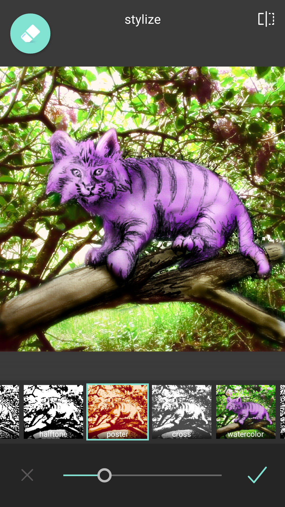
I am selecting poster and erased the foreground out again. I did this to bring some of those red browns into the shadows of the background in order to make more of a seemless transition into the foreground. Any colors you can accent to bounce between. The two will help bring it into a more scenic view and less superimposed. The same can be done with bold blacks however line variation and an over all cartoonist style will have to be balanced then. For the sake of keeping it simpler here this is the selection we will move forward with.

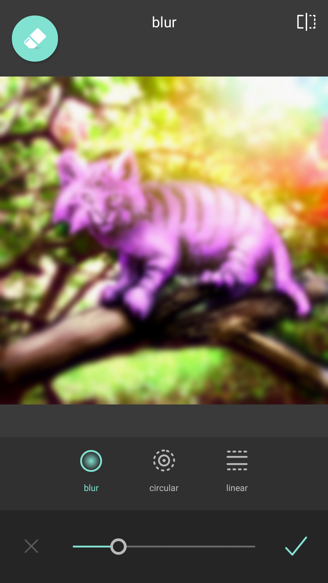
Next go back to the tools menu and this time select blur.

I switched it to circle so we can have more and optical perspective bluring. Like always erasing will be a neat truck here because we can choose to erase the effect on parts of the cat making him pull forward while still feeling like it exists in the space.

After your erasing and painting you can still shift the Hotspot and the inner and outer rung to adjust how gradient the blurring is and where it starts.
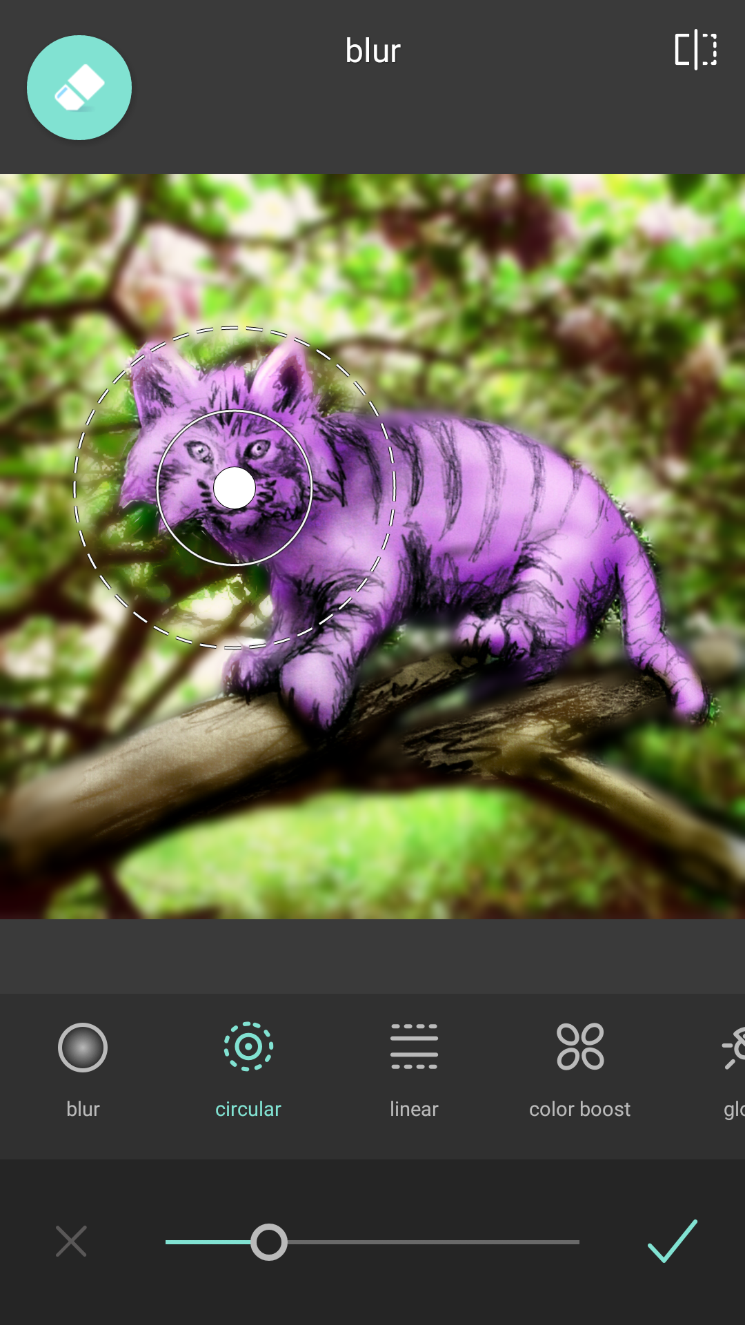
I won’t use it this time but there are some other neat features like color boost, glow and a linear blur instead of circular so make sure you check those out too.
At this point you have an image that is starting to feel nearly there but can still use some minor tweaks and finishing touches to really give it that strong finished feel.
So let’s get to adding some nice effects now.

So selecting layers > effect > soft we see these glamour shots sort of filters that make everything all warm and fuzzy.
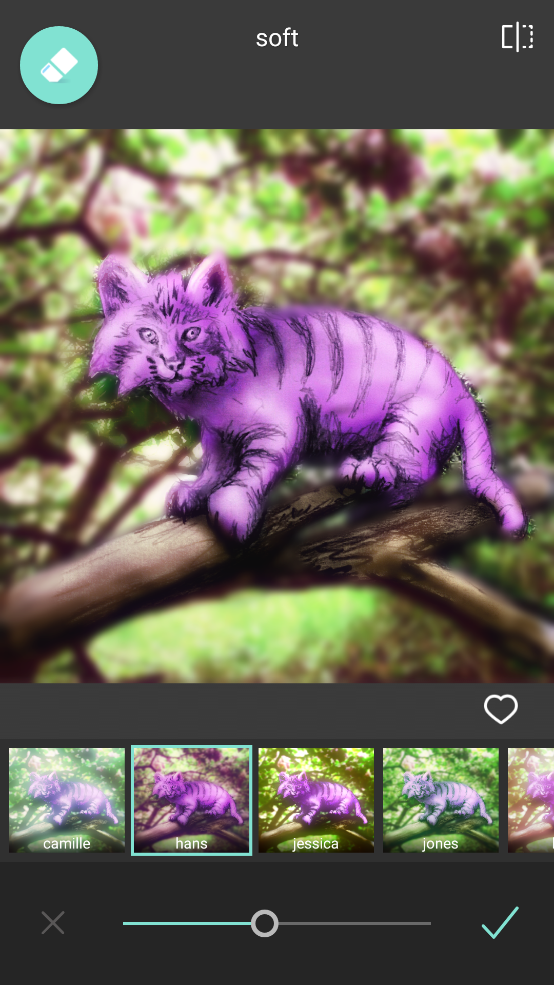
I selected Hans because it gives that warm soft light across the scene that ties it all together. This time no erasing because I want it to really unify the whole image by giving it a common hue. I will tone it down though as everything I will do will alter color from here on.

Next we go to layers > overlay > Chem burn. While these are to be a mimic of chemical mishaps in traditional exposure of photography they also can be used for amazing lighting effects.

Early looks like… well an early morning sunrise. Warm and fuzzy right. It is however in the wrong spot for what I would like.
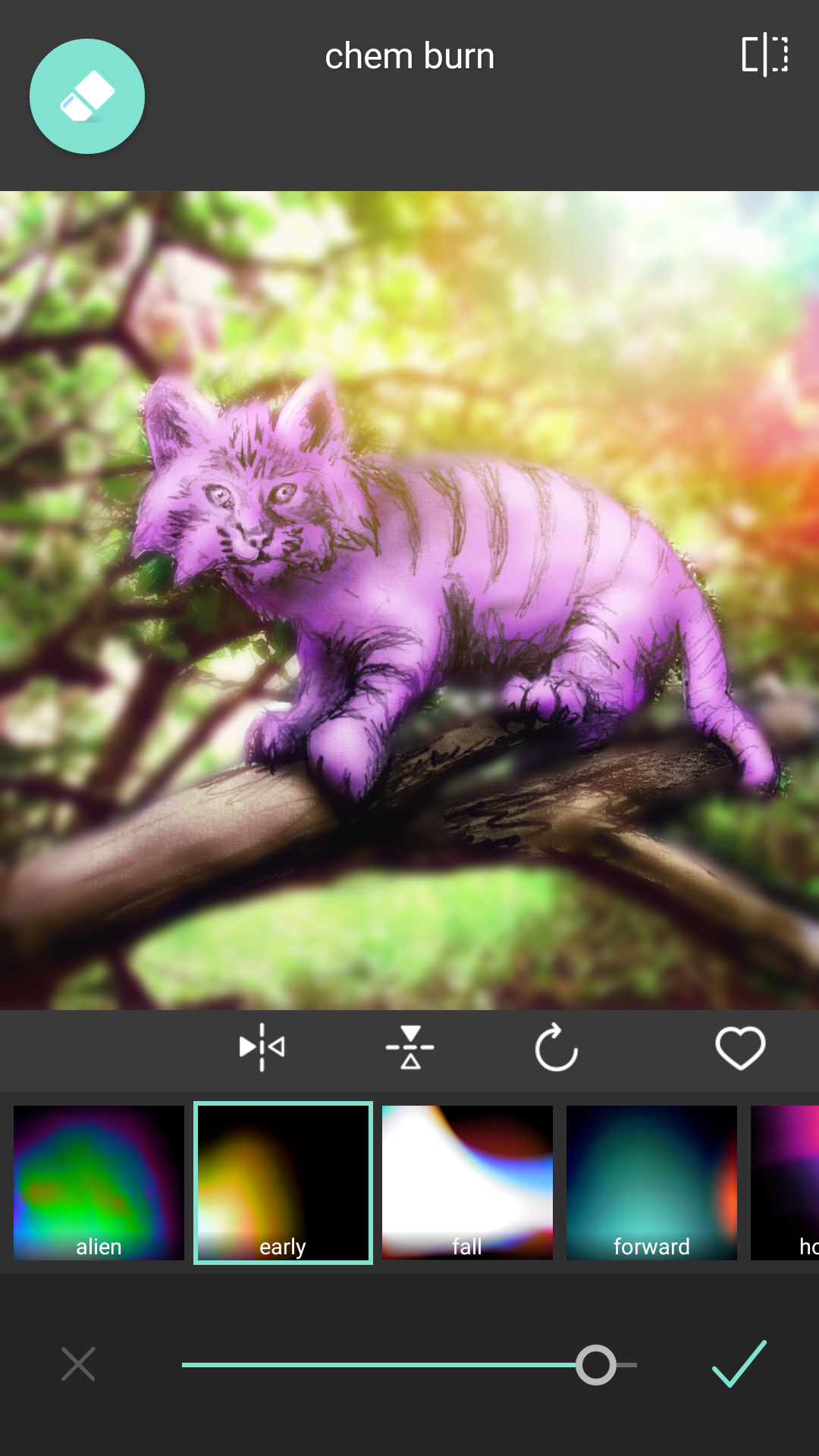
Rotating and flipping I place it where I want and tone it down just a bump. The edges of the cat are starting to bother me with the contrasted graininess that is starting to stick out so go back to the blur tool under tools.
Erase out everything and just paint where you want blur. Think of it like a touchup tool.

Take your time to make sure you are not blurring where you don’t want or not enough in areas.

Once it is where you like it. Hit that checkmark and it is on to frames.

There are so many frame choices as well seasonal ones the company has been adding. So under frames > default I am going to select film for that letterbox feel.
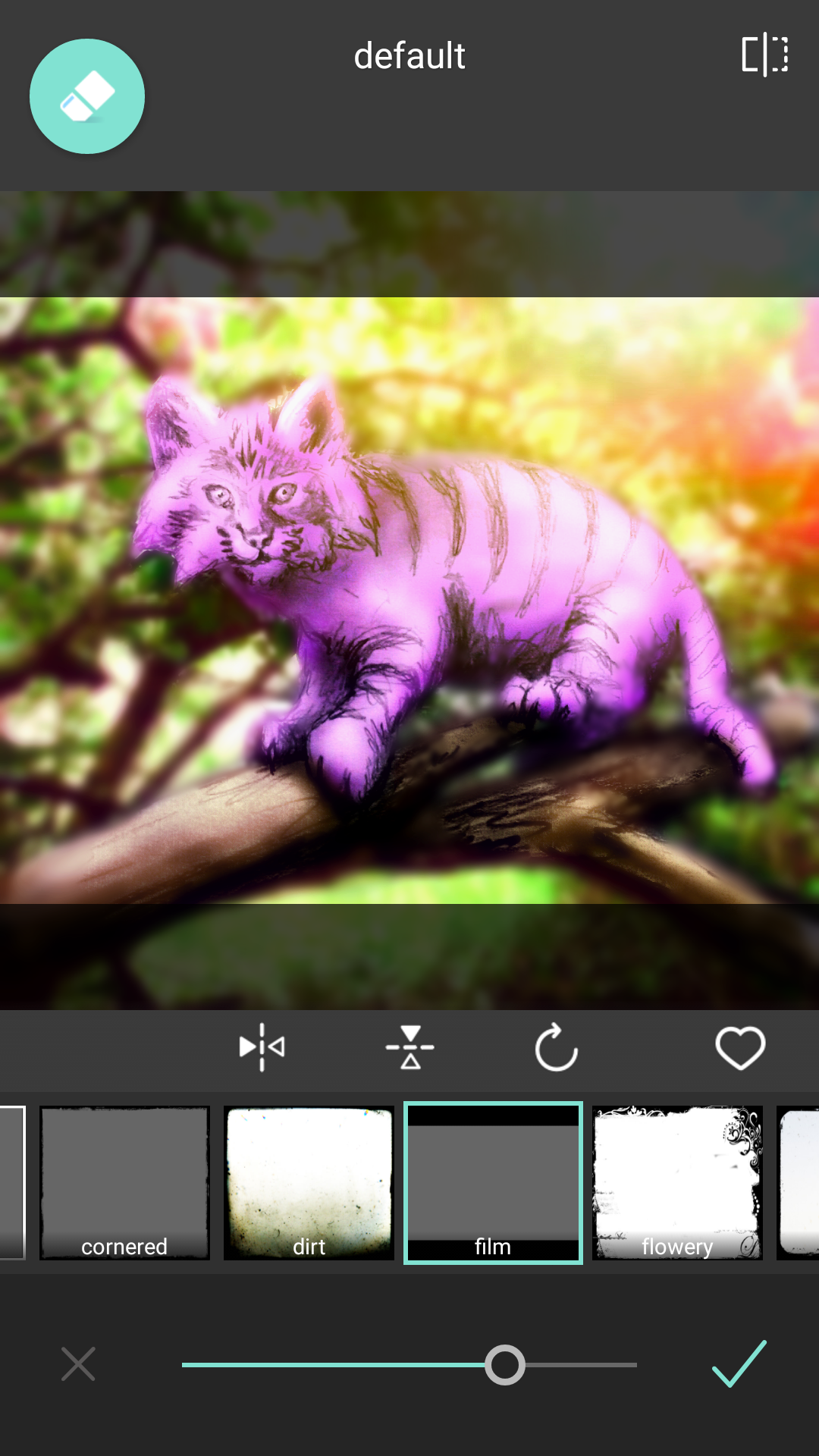
Now notice here something really cool. I can control the translucency of the frame! Sliding to the right makes it solid black but I like the framing without losing part of the drawing I did so I played with it till I found the right balance. I also have to point out that the eraser tool is still there meaning if i wanted to erase out parts of the frame that is an option. While I won’t do that for this project there are so many cool scenarios you can use that erasing tool on frames for awesome effects.
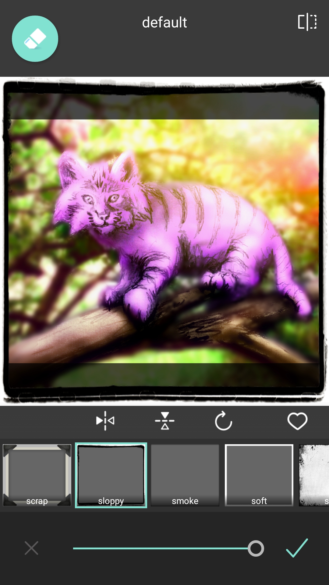
The film frame wasn’t enough for me so I added Sloppy on top to really give it that complete look I wanted.

So here we are at the end so hit done and save BUT WAIT. Just because you are finished here doesn’t mean you can’t important into other apps for photo after effects. There are so many photography apps that you can add some finishing touches with this so play around. I personal took it into Insta Lens Flare to add some extra pop to that sun breaking through the trees.
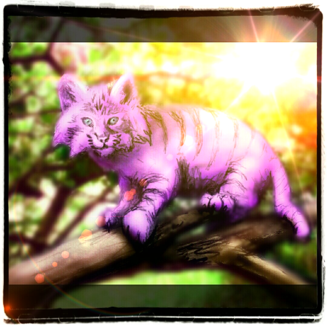
The sun is pretty bright shinning down on our warm and fuzzy Cheshire cat. I did a couple touch ups and gave him green eyes for this too using the same methods you have learned. Here is the before and after so you see the initial drawing compared to what was done with a couple apps on a phone.

I hope you found this educational and enjoyable. Thank you for joining me. See you on the next page fans….
